
colour is coming in HOT right now – no brakes, no apologies, and as a faithful devotee to minimal, neutral interiors up to this point, I am 100% here for it

Journal
Colour crushing
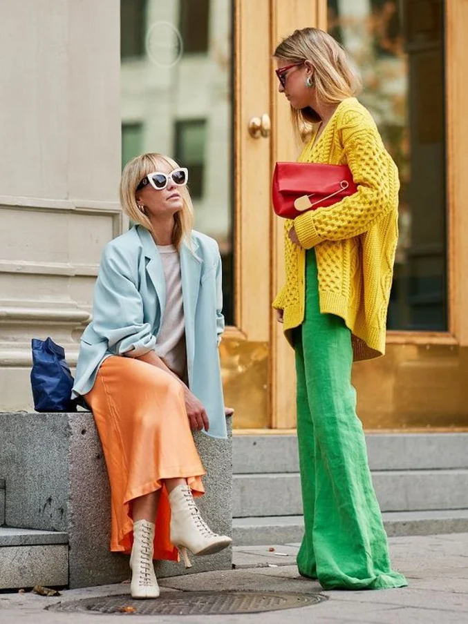
I’m not sure what it is – high summer in the Southern Hemisphere or the prolonged amount of time spent indoors seeking anything visually uplifting. Perhaps it is the resurgence of the late twentieth century interior palette, or possibly the vibrant confidence of our very own ‘roaring twenties’ fashion revolution, but colour is coming in HOT right now. No brakes, no apologies, and as a faithful devotee to minimal, neutral interiors up to this point, I am 100% here for it. Full Spectrum is a growing trend in celebration of the vivid, non-conforming, and unapologetic vigour of colour. Emerging from a digitally drenched time indoors, we have been inspired by ever bolder colour and pattern combinations and a desire to enliven all surfaces with unconventional, enticing, clashing, and invigorating colour.
We look particularly to cultural references – think staccato, joy inducing patterns in pigment rich shades, combos designed to pop. Black and white anchor and boost these bold choices and can also be used to amplify and reflect them. Strong, undiluted primary shades also dominate here, leveraging boho style and confidence. Create another dimension by adding surface interest and a handmade feel of pure craftsmanship.
Another interpretation puts typically discordant shades together confidently. Pulling together the unexpected can broaden our thinking – vintage or antique pieces are reinvigorated in bold, contemporary shades, then contrasted with stark modern items and everything in between. A blend of styles playing against one another with the common thread of riotous shades is certain to enliven and energise the senses.
Conversely there are ways to layer shades with similar bases – think bright red with fuchsia, burgundy, ochre and rose. A rich, warm and amplifying effect is created where there are optimistic tones to brighten the mood.


If your heart skews to more nature-inspired shades, green or blue is every bit as effective, but move beyond the exact colours of the outdoors and instead think cleaner, more vivid, ice creamy, even surreal. To revitalise an area in unexpected ways, drop in the surprising palette cleansers of lavender and violet to reference the rise of digitally generated spaces, or incorporate a touch of white and silver to keep it light and bright.


Image sourced from Pinterest
Originate your own serene space in the home that draws on the inspirational photography from Mokum fabrics new collection ‘Ikigai’. Artisanal craftsmanship is celebrated and revered within Ikigai, (‘iki’, meaning life and ’gai, meaning value) and was carefully captured in a photoshoot that spok...