"I like colours in combination even more than in isolation."

Journal

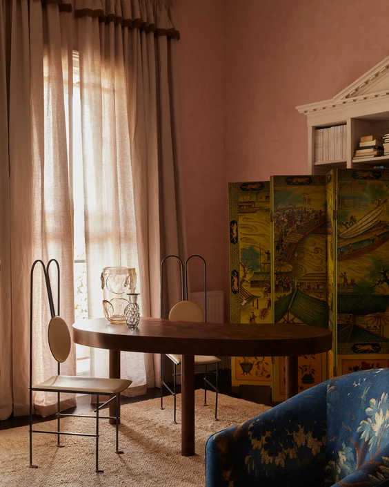
Sofa in Luxo colour Sand by Zepel | Interior by Tali Roth | Photograph by Lillie Thompson

Curtains in Kyoto colour Harvest by James Dunlop (colour discontinued) | Interior by Tali Roth | Photograph by Lillie Thompson

Sofa in Bronco colour Sunflower by Zepel, Curtains in Satori Stonewash colour Celadon by Mokum | Interior by Tali Roth | Photograph by Lillie Thompson
Q&A | Tali Roth on colour
Melbourne-based interior designer Tali Roth is known for her confident colour combinations. Launching her eponymous studio in New York, where she lived and worked for twelve years before returning home to Australia, her style is a curated fusion of mid-century California, traditional New York, and contemporary Australian cool.
We spoke to Tali about the similarities and differences between American and Australian design aesthetics, her favourite colour combinations, and the creatives she looks to for inspiration.
Curtains in Satori Stonewash colour Blush by Mokum | Interior by Tali Roth | Photograph by Lillie Thompson
How did your experience in New York shape your design aesthetic?
How did your experience in New York shape your design aesthetic?
When we left, I was looking up to various Australian-based firms that were really pushing the Scandinavian design aesthetic. I arrived with a very Aussie sensibility of new builds and minimalism; a contemporary approach to design which New York is the opposite of – as is America in general.
A traditional aesthetic is considered the ideal, and at first that was scary to me, but I totally get it now. I began to appreciate heritage because old things make design relatable and feel good, they make it timeless.
I think that's what New York did to me. And it's funny, coming back that diminished a little bit almost immediately. I still run jobs in New York and the girls I work with who have known me for seven years are like “wait, what's going on? Why are you suggesting all these really contemporary pieces?” So, the environment definitely shapes and affects you.
How does design differ between America and Australia?
How does design differ between America and Australia?
New York is not like the rest of the states, it's its own thing because it's so densely populated with apartment-heavy living. I don’t think you can get away with a light touch or a minimalist approach, New York is far more maximal – more is more – it’s a little showier and much heavier on soft furnishings and wallpaper.
The interaction between nature and home in Australia plays a much bigger role in design than it does in a city where your connection to nature is so small, because you don't get these great outlooks most of the time. I think that the home in New York really does need to be a sanctuary. You have to do so much more with smaller spaces and the weather can also be really severe; when really cold winters take up a huge part of the year people lean on colour a lot.
How does colour differ between New York and Australia?
How does colour differ between New York and Australia?
Here in Australia, Flack is the most celebrated interior designer. So, while I would say that colour is definitely part of Australian design, I tend to think that people who don't have access to an interior designer would stick to grey, white, or cream but I don't feel like that's the same in America. I feel like they would have more colour or at least a warmer aesthetic and would veer away from minimal tones.
I do think the colours differ, but I do think that people who are aspiring to a certain level of design in Australia are totally into the same kind of colours. But again, it's in a more contemporary way. In Australia, it's bolder, colour-blocky, and aggressive, I don't think designers are trying to make statements with colour in America because the population is so great.
When you're designing a space, do you think about the mood that colours will evoke?
When you're designing a space, do you think about the mood that colours will evoke?
I do, but I don't really stick to rules. I think colour is part of the equation, but it's also about the shape of the furniture and the lighting – it’s everything. I think that people who use colour live life well. You never walk into a home that has lots of colour and think wow, these people are so drab.
I often experiment with colour in smaller spaces and in sleeping spaces, so my children’s bedrooms are quite heavily coloured, whereas mine isn't. I also don't often put heavy colour into living spaces; I'll go more colourful with furniture and soft furnishings rather than the walls.
Which colour combinations are currently inspiring you?
Which colour combinations are currently inspiring you?
I love the juxtaposition of colours. I've always loved vermillion with a nude or a beige, or a bright yellow with a beige, a tan, or caramel. I love chocolate with a sage green and putting in silvery tones. I love purple – certain purples – and caramel. I like colours in combination even more than in isolation.
My all-time favourites are unmoving. I'm a huge green fan, I can pretty much get around every part of the green family. Whether it's a snoopy, very bright green, or a Caribbean summer mint green, or a very dusty sage grey green – I love them all. The same with oranges, reds, and rusts – I love orange-red, I love a bright vermillion.
I've never ever been a blue person but I'm starting to inject more blue into designs. At the moment I’m into blues that are slightly duller version of an Yves Klein but are still quite bright, which works in combination with the colours I'm talking about. It works nicely with a yellow, a rust, a purple, a hint of silver – it's quite a 70s palette.
Which creatives do you admire for their use of colour?
Which creatives do you admire for their use of colour?
I look to fashion for colour combinations. I am obsessed with Dries van Noten and Loewe’s colour combinations, I think they choose them brilliantly.
I look to anything Italian to inform me about colour. I look at what the Italian fabric companies are pulling together in terms of a pattern with a great colour combination in it. Dimore Studio are very aspirational furniture designers; I always look to them and although I find them inspiring, I don't want to create that because I like timeless, liveable spaces. But I'm always drawn to the tension of teetering on almost-ugly colour combinations.
How do you know when colours go together?
How do you know when colours go together?
It's definitely not colour theory, I think it's just personal preference and taste. Over time, I think that you can study your own tendencies and start to notice things that you've always liked. I remember seeing the Little Mermaid when I was a kid and being very confused but enamoured by the combination of her red hair and a pink dress. When we moved into our new home, I kept thinking about how much I like clashing colours that are against what you ‘should’ put together.
But nature is so informative. I'll be somewhere and think, ‘Tali why do you find this view so beautiful?’ Then I’ll transfer it into colours like ‘okay, well, I'm looking at caramel, cream, and very deep blue.’ And I never really pair those colours because that feels way too serious and sophisticated; but then you transfer them into reality, and it works.
"I'm always drawn to the tension of teetering on almost-ugly colour combinations."
"I'm always drawn to the tension of teetering on almost-ugly colour combinations."
Stemming from a desire to inject colour and pattern into the brand’s wider range, the Modern Art collection was greatly influenced by the ideas behind the Abstract Expressionist movement, which placed New York at the centre of the art world in the 1940s and 50s. In addition to cultural similariti...
